We discuss your project goals, location, story and vision.
Saretta develops a design concept based on cultural storytelling and your project context.
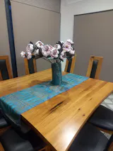
The artwork is created using high quality materials suitable for the project scale.

The finished artwork is delivered or installed, ready to become part of your space.
Recent Commission Projects
Logo and Graphic designs
Macquarie Shores Swim Centre
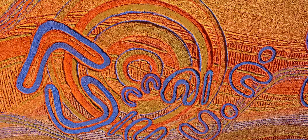
Students from Lake Macquarie schools came together at Nikinpa Aboriginal Centre on Friday 5 May 2017 to participate in a local Aboriginal design program for Macquarie Shores Swimming Club with renowned local Aboriginal artist Saretta Fielding.
Funded through Multicultural NSW the program was aimed at sharing culture through Aboriginal art around the theme: Celebrating Aboriginals Peoples Connection to Lake Macquarie. The workshop started around morning tea with local Elders, where the students had opportunity to meet, chat and learn more about the local Aboriginal community. Student was selected by their schools to participate in the program with representatives from Toronto High, Biraban, Acadia Vale, Coal Point, Rathmines, Awaba and Lake Macquarie High schools.
Aboriginal Housing Office NSW Bowangkaliko Malang - Rise Together
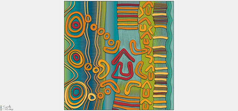
This vibrant artwork highlights the story of the Aboriginal Housing Office NSW and their pioneering transition, to better meet the needs of Aboriginal people in NSW.
Celebrating Aboriginal people and culture, the piece is reflective of the innovation, collaboration and commitment to a client centre focus that embraces community involvement and respects cultural diversity.
The works visual storyline captures the passion and vision to create sustainable housing opportunities that redress history and reflect the desire to make a difference.
Original artwork concept and creation by Saretta Fielding
Graphic Interpretation by Carissa Paglino
Aboriginal Housing Office - Graphics
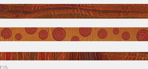
Produced for a AHO brochure
Community Sector Banking Kolang Maroong Mankan - Toward Good Place
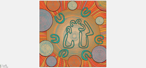
Kolang Maroong Mankan, meaning ‘toward good place’ reflects Community Sector Banking’s vision to help create change for a ‘better world’ and a ‘brighter future’ for all. The work shares Community Sector Banking’s 14-year journey thus far, highlighting their vision to strengthen not for profits in delivering social change, community wellbeing and their impacting commitment to reconciliation.
Lake Macquaire Area Command - NSW Police
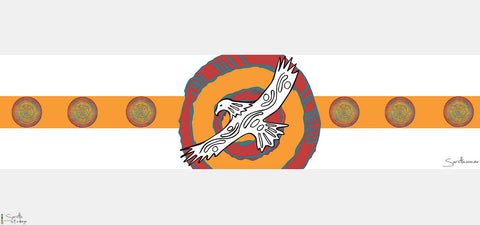
Produced for the opening of the Toronto Police Station 2017
Guudgi-yiigu - ‘Welcome we come here together’

The Title of this artwork acknowledges and respects the Worimi Nation and is representative of togetherness, people, place and partnership. Strategically placed at the service entrance of the Raymond Terrace Community Health Service Guudgi-yiigu welcomes all and promotes a respectful relationship to be developed across cultures.
Konara Malang, meaning ‘Family Together’

This artwork is located at John Hunter Hospital Maternity Out patience. The artwork tells the story of families (konara) and children (bobong) from across our region coming together (malang) in partnership and connection with maternity out patience as women (nukang) move through their pregnancy journey. The eight circles flowing down the right of the mural (8 signifying ‘New Beginnings’) are traditional symbols for women meeting together.
Original artwork concept and creation by Saretta Fielding
Graphic Interpretation by Carissa Paglino
Previous Logo design projects
Koori Slushies

This vibrant and colourful Koori Slushies artwork and logo is full of life, celebration and fun.
With emphasis on coming together as a community to enjoy gatherings and events, the traditional circles within the artwork are also symbolic of the three main products available - Slushies, Snow Cones and Pop Corn. Fanning out from each circle is a colourful array of people symbols reflective of festivity and the enjoyment of all Koori Slushies has to offer.
The colour blue and pink within the name encompasses all boys and girl’s love of koori slushies, with the extensive use of blue within the overall design is reflective of these delicious icy treats of slush and snow.
Bright and rainbow colours within the artwork link to the many wonderful flavor’s Koori Slushies have on offer.
Widyarra Group

Corporate logo for the Widyarra Group, Parent group of Koori Slushies.
Strategic Small Business Solutions
This artwork design represents Strategic Small Business Solutions and the sound business support they provide.
The large expanding circle within the design is reflective of coming together around shared vision and expansion or business growth, while the four bands of this central meeting circle, along with the four smaller community circles running down the right side of the design are link to the key development areas of SSBS being:
- Business and operational management
- Sales and marketing
- People management &
- Businesses growth strategies
Colours used within the work relate to our country depicting all areas including coastal, dessert and highland areas.
Ability Links
This artwork is a visual footprint of the Ability Links program across NSW. The three cultural symbols for people linked together and central to the work have a twofold meaning:
They highlight the three main stakeholders in the program, people with disability, their families and carers and depict linkers working alongside people and communities. The expanding circles within the peoples’ heads culturally symbolize meeting place and in this piece represents the coming together (meeting) of people across community to help achieve linker members’ personal goals.
The figures sit on top of interwoven circles which represent the many tribal groups of the NSW communities across the state. The central red circle represents the Heart of this program and its values of quality, trust, respect, understanding and cultural appropriateness, while the 27 small circles sitting within the 3 people figures symbolize the 27 Aboriginal identified Linkers within local communities across NSW.
Original artwork concept and creation by Saretta Fielding
Graphic Design interpretation by Carissa Paglino
Koori Kinnections

This logo presents an easily recognizable design that is clear and concise engaging the Aboriginal people of NSW and reflecting FACS identity, denoting quality, trust, respect, understanding and cultural appropriateness.
The designs central focal point highlights connection and mutually respectful relationship by working together across the services and programs FACS brings to our community with the aim of providing improved social and economic outcomes for our people.
Original artwork concept and creation by Saretta Fielding
Graphic Interpretation by Carissa Paglino
Forestry Commission of NSW
Wakool meaning ‘One’ in the Awabakal language tells the story of one with each other and with Country! The artwork highlights that for tens of thousands of years Aboriginal people have lived and cared for country, our existence intertwined with, and connected to all Baiyami (creator) entrusted to us to partake of and care for. The artworks aims to evoke that special link through the interwoven lines of an Aboriginal man, women and tree, demonstrating the shared dependency between man and country.
Original artwork concept and creation by Saretta Fielding
Graphic Interpretation by Carissa Paglino
Birra-Li

Konara – Meaning Family or Clan is an artwork that celebrates life, family connections, the joy of pregnancy and the wonder of birth.
Depicted in this image we see a young growing family content as they enjoy family life and happiness in anticipation of the arrival of a new family member. The konara are illustrated in a wonderful traditional local place, within the Hunter, which is still visited by wonaruah people today.
Relationship Australia

Mariyang Malang – meaning onward together in the Awabakal Language tells the story of strong healthy relationships across family, community and partnering organisations, around shared vision in the journey towards reconciliation.
The three Aboriginal symbols for people, with joined hands, at the very centre of the image provides immediate recognition of the high value placed on good relationships and promotes visual identity for Aboriginal people of NSW. Hands linked in the design is reflective of Relationships Australia’s vision of a harmonious and inclusive society, which promotes and supports respectful and resilient relationships for families and their communities.
Original artwork concept and creation by Saretta Fielding
Graphic Interpretation by Carissa Paglino
Saretta Art & Design

My Logo aims to capture the essence of my artwork, simplicity and beauty of design through organic shape, traditional symbolism and contemporary colour creating a visual story. The circles represent people coming together as community.
Testimonials
DEBORAH GUION, HEAD OF CORPORATE RESPONSIBILITY
WINC
When we were looking for a unique Indigenous artwork for our office, Saretta quickly become our choice of artist to tell Winc’s story.
I can highly recommend her professionalism and collaborative approach – her finished artwork speaks for itself.
LISA WARREN, SENIOR HR BUSINESS PARTNER
Hunter Water
Working with Saretta and her team to develop the artwork for our Reconciliation Action Plan has been an absolute pleasure. Saretta’s warmth and generosity made the process incredibly informative, contemplative and enjoyable.
Danielle Gentles, Project Manager
NSW Communities and Justice
It has been a fabulous journey from the beginning in the workshop and now to have the opportunity to have our story evolve into this beautiful artwork which has a direct linkage and connection to all of us.
Jill Murray, Head of Marketing & Communications
Arcadis
Thank you Saretta and John for all your help with artwork and creatives for our Reconciliation Action Plan.
We really wanted to tell a creative visual story, and we really appreciated that you took the time to work with us and understand what we wanted to convey.


